Overview
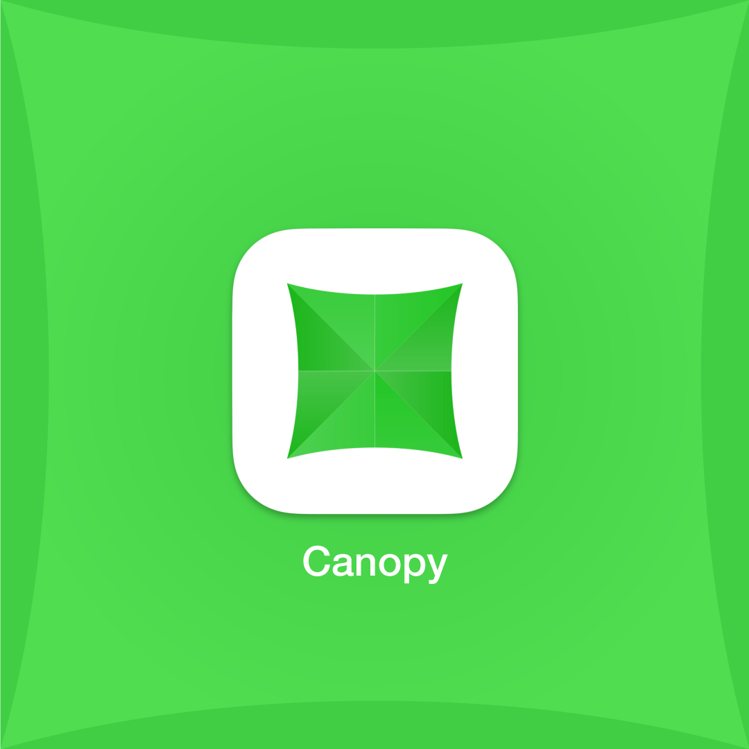
Canopy was a desktop app developed by Homebrew creator Max Howell that offered real-time notifications for GitHub. If you're a developer, or if you've used GitHub in any professional capacity, then you understand the need for real-time notifications—especially when working on projects with tight deadlines.
- Brand Design
- Logo Design
- Graphic Design
- Icon Design
- Adobe Illustrator
Background
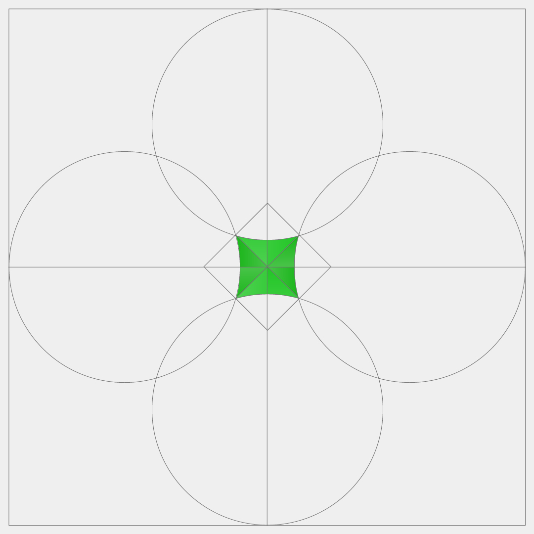
Max asked me for an icon. He didn't provide many examples or guidelines, just a basic overview of what the app would do—so I had a great deal of creative freedom. I wanted the icon to be minimalistic, simple, and memorable. The functionality of the app was simple (but necessary), and I wanted the design to match. I went a little 'on the nose', admittedly, with the imagery of a literal canopy... but in this case, I thought it was appropriate. The name 'Canopy' came from the idea that the app enabled users to 'see everything', so why not show that? The green color was inspired by green text message bubbles. I felt that drawing inspiration from the functionality Canopy was bringing to GitHub would help solidify its use case in the minds of users.
The Challenge
The app was simple and straightforward in functionality, with no UI through which to flesh out a more comprehensive brand aesthetic. Thus, the icon needed to say a lot with just a little. Everyone was happy with the end result... it said what it intended to say and achieved its goal of being a 'damn good' app icon.